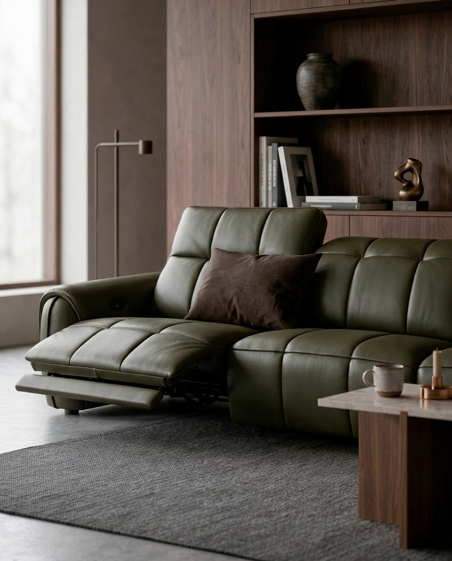
How to Mix and Match Upholstery Colours in Your Home
Choosing the right upholstery colour can make a big difference to the overall look and feel of your interior. A sofa in a complementary shade can help create a calm, coordinated space, while a contrasting armchair can introduce character and become an interesting focal point.
But how do you know which colours work well together? Should your sofa blend in with the walls, or should it stand out? And do all your upholstered furniture pieces need to match?
The good news is that there is no single formula to follow. It comes down to understanding your existing colour scheme and knowing how different tones can work together.
Here are some ways to mix and match upholstery colours to create a balanced interior.

1. Take Inspiration from Your Existing Interior
Before choosing your sofa or chair upholstery, take a look at the colours that are already part of your space.
Your walls, flooring, curtains, rugs, cabinets, and other furniture all contribute to the overall colour palette. These elements provide a starting point for selecting upholstery that either complements the existing scheme or introduces a contrasting tone.
Pay attention to whether the room has predominantly warm or cool colours.
Warm palettes often feature beige, cream, caramel, brown, and earthy shades. Cool palettes may include grey, blue, muted green, and cooler neutrals.
You do not have to follow these colour directions strictly, but understanding the existing palette helps you make more intentional choices.

2. Keep It Cohesive with Complementary Tones
If you prefer an interior that feels calm, coordinated, and easy on the eyes, working with complementary tones is a good approach.
This means choosing upholstery colours that sit comfortably alongside the existing shades in your room. They may belong to the same colour family or share similar undertones.
For example:
Cream and beige: A soft combination that creates a light and welcoming atmosphere.
Taupe and warm brown: A grounded palette that pairs naturally with timber furniture.
Light grey and charcoal: A contemporary combination with subtle tonal contrast.
Sand and caramel: Warm, earthy shades that add depth without feeling too bold.
The key is to avoid making everything look exactly the same. Introduce variation through different shades, textures, and materials.
A beige fabric sofa, for instance, can be paired with darker brown leather armchairs or a textured rug in a similar warm palette. The colours remain connected, but each piece has its own presence.

3. Add Personality with Contrasting Tones
Want your furniture to stand out? Try introducing contrasting upholstery colours.
Contrast creates visual interest by placing different tones together. This could mean pairing light and dark shades, warm and cool colours, or neutral upholstery with a more expressive accent.
Some combinations to consider include:
Navy and cream: Deep blue creates a distinctive focal point against a lighter neutral setting.
Olive green and beige: An earthy combination that feels relaxed while adding colour.
Terracotta and grey: Warm terracotta brings energy and character to a cooler palette.
Dark brown and ivory: A classic contrast that creates depth and definition.
You do not need to make every furniture piece a statement. One contrasting piece can be enough to change the character of a room.
For example, a neutral sofa can serve as the main foundation, while an accent armchair introduces a deeper or more colourful tone. This creates a natural focal point without making the overall interior feel too busy.

4. Pay Attention to Lighting
Have you ever noticed how a fabric colour can look different in a showroom compared to your home?
Lighting plays a significant role in how upholstery colours appear. Natural daylight, warm indoor lighting, and cooler artificial lighting can all influence how a shade is perceived. A beige fabric may appear warmer under yellow lighting, while grey upholstery can take on a cooler appearance in a room with limited natural light.
The direction and amount of natural light also matter. A brightly lit room may bring out the subtle details of lighter upholstery, while darker spaces may make deeper colours feel more prominent.
If possible, bring upholstery samples into your room and view them under different lighting conditions before making your final selection.

5. Consider the Size and Layout of Your Space
The colour of your upholstery can also influence how furniture feels within a room.
Lighter shades often create a softer visual presence, making them a popular choice for smaller spaces or interiors where an open, airy atmosphere is preferred.
Darker upholstery can give furniture more visual weight and help establish a focal point. In a larger living area, a deep brown or charcoal sofa can anchor the space and create a sense of definition.
However, this does not mean smaller rooms should avoid darker colours. A dark sofa can work beautifully when balanced with lighter walls, flooring, and accessories.
Rather than following strict rules, consider how the furniture's colour, size, and placement work
together.

6. Mix Different Furniture Pieces with a Common Direction
Your sofa, armchairs, and dining chairs do not have to share the same upholstery colour.
In fact, using different tones can make an interior feel more layered and considered. The trick is to find a common element that connects the pieces. This could be a shared undertone, a similar texture, or a colour that appears elsewhere in the room.
For example, a dark grey sofa with wooden base can be paired with tan leather armchairs, while dining chairs in a beige tone introduce another layer of colour. Even though the upholstery shades differ, the warm and earthy wood tones helps tie the interior together.
You can also use cushions, rugs, curtains, and decorative accessories to repeat selected colours throughout the space.

Find the Colour Combination That Works for You
Choosing between complementary and contrasting upholstery tones is ultimately a matter of personal style.
Complementary colours create harmony and continuity. Contrasting colours bring depth and character. And when used together thoughtfully, they can create a more layered and interesting interior.
Start with the colours you already have, explore different combinations, and consider how each piece contributes to the overall atmosphere.
After all, a well-designed space is not about making everything match. It is about finding the right balance between colour, texture, and form.
Explore HUGO's colour and material possibilities for your next collection.